I just spent the last school year immersed in
Canvas by Instructure. By that I mean I taught six periods a day via Canvas and I took two grad school courses per term via Canvas. Based on that experience, I'd like to offer some suggestions, some advice to teachers who are considering it, based both on how you can use it to make your life easier and your students' lives easier. It's an incredibly powerful platform, one that I
highly recommend, having been on both ends, but that means it can easily be misused, misunderstood.
If you're one of those teachers who says, "It's not my job to make my students' lives easier," let me explain. You're not making their workload easier, you're just making the class experience easier. There's a difference. If you're going to be teaching blended or online classes, your job just expanded to include user experience.
 |
| So much learning to do. |
1. There will be a learning curve.
From the teacher side, this is no surprise. No matter how intuitive a platform is, it takes some getting used to. The more powerful a platform is, or the more options there are, the more there is to get used to. Numbers 2 and 3 below will help with this.
On the student side, they'll need some training, some practice. Set aside a few days for students to get comfortable with it. Create easy assignments and quizzes so they get the hang of things before the pressure is applied.
2. Create a pattern and stick with it.
Ideally, every teacher at a school would use Canvas the same. Unfortunately, they don't, and they probably never will. In my program, I have some teachers who use Announcements religiously. Others simply send Canvas messages to all the students. Luckily, in my case, each teacher/class follows a pattern. One teacher makes everything on Tuesday, so my brain quickly learns that Sunday or Monday I better be finishing up some homework for that class.
Beyond due dates and communication preferences, use a pattern in your page/assignment/quiz design. If you rely in video to get the lesson out, put it in the same place each time. Use the same colors and headers and so on. You get it, right?
3. Keep it as simple as possible.
This relates back to the first two suggestions. If you keep it simple, the learning curve will be easier to handle. Setting up patterns also helps you keep it simple. If you create a pattern of one reading assignment and one quiz per week, it'll not only be easier for your students, but it'll be easier for you to set it up. It'll be simpler.
If you have a bunch of PDF's or Word documents, you can simply insert them into pages or assignments, and students can view them inline or download them to view or print. This creates less work for you at first, but it should only be a temporary solution. Eventually, to keep it simpler, you'll want to convert these things into a more online-friendly format. If it's a worksheet, you can turn it into a quiz. If it's an assignment description, you can format it within Canvas or even create a video to demonstrate it. If it's a PowerPoint presentation, you can turn it into an online version that's easier to move through.
 |
| Grading puts a smile on my TA's face. Either that or she's doing something else on the computer. |
4. Carefully craft your rubrics and employ TA's.
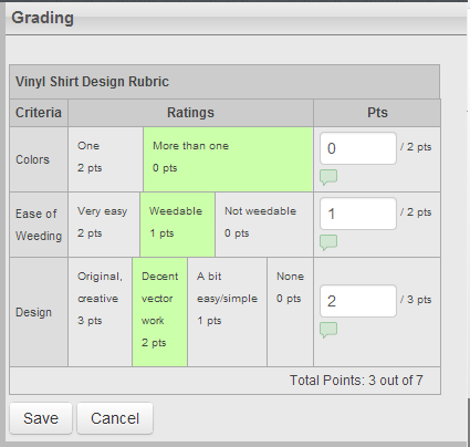
One of the greatest things about Canvas for a teacher is the SpeedGrader. Seriously, on its own it warrants a switch to Canvas. Better still is when you attach rubrics to assignments. Just select each criterion and Canvas transfers the points into the student's grade.
 |
| One of my better rubrics. It matches the assignment description and it's easy to use. |
The trick is to create the right rubric that gives credit for the right effort. It has to match the assignment description and it has to be easy to use. I like to give the assignment, see how students do, then create the rubric. If done well, and if you have a good TA, you can pass on much of the grading. Then, if a student complains about a grade, you can blame your TA.
 |
| I think most image results for "due date" revolve around pregnancy... |
5. Use due dates wisely.
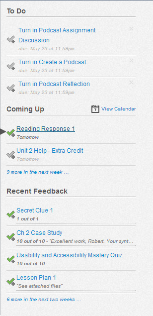
Almost everything you set up in Canvas looks the same to you as it will to the students. Except for the dashboard, or the page everyone first sees when they log in. When a student logs in, she sees a list of upcoming assignment due dates, among other things.
 |
| Items under "To Do" that you don't actually have to do are annoying. |
If set up well, this is an incredibly useful task list for students. But if you excessively use dummy assignments, or if you create a due date on the assignment but students are supposed to submit a draft earlier, it becomes very confusing.


No comments:
Post a Comment